Up to date
This page is up to date for Godot 4.2.
If you still find outdated information, please open an issue.
Introduction to GUI skinning
It is essential for a game to provide clear, informative, and yet visually pleasing user interface to its players. While Control nodes come with a decently functional look out of the box, there is always room for uniqueness and case-specific tuning. For this purpose Godot engine includes a system for GUI skinning (or theming), which allows you to customize the look of every control in your user interface, including your custom controls.
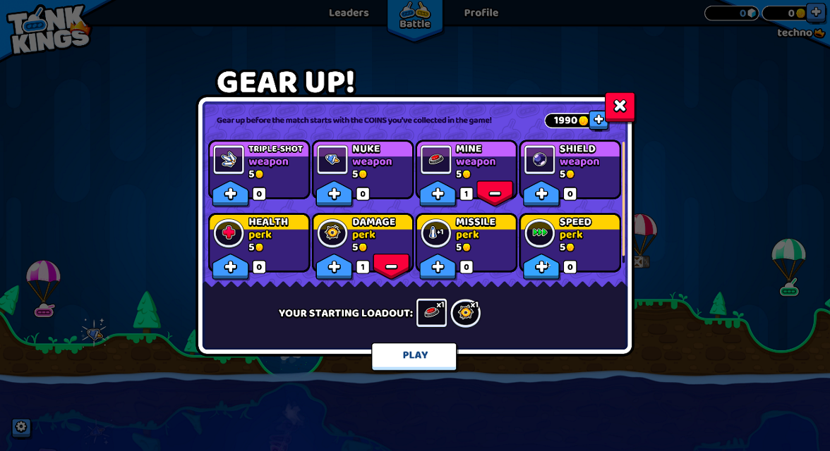
Here is an example of this system in action — a game with the GUI that is radically different from the default UI theme of the engine:
A "Gear Up!" screen in Tank Kings, courtesy of Winterpixel Games
Помимо достижения уникального внешнего вида вашей игры, эта система также позволяет разработчикам предоставлять конечным пользователям возможности настройки, включая параметры доступности. Темы пользовательского интерфейса применяются каскадным образом (т.е. распространяются от родительских элементов управления к их дочерним элементам), что означает, что настройки шрифта или корректировки для слепых пользователей могут применяться в одном месте и влиять на все дерево пользовательского интерфейса. Конечно, эта система может быть использована и в игровых целях: ваша игра, основанная на герое, может менять свой стиль в зависимости от выбранного персонажа игрока, или вы можете придать разный вкус сторонам в вашем командном проекте.
Basics of themes
Система скинов управляется ресурсом Theme. Каждый проект Godot имеет встроенную тему по умолчанию, которая содержит настройки, используемые встроенными узлами управления. Это то, что придает элементам управления их отличительный внешний вид из коробки. Однако тема описывает только конфигурацию, и каждый отдельный элемент управления должен использовать эту конфигурацию так, как ему нужно для своего отображения. Это важно помнить при реализации собственных пользовательских элементов управления.
Примечание
Even the Godot editor itself relies on the default theme. But it doesn't look the same as a Godot project, because it applies its own heavily customized theme on top of the default one. In principle, this works exactly like it would in your game as explained below.
Theme items
The configuration that is stored in a theme consists of theme items. Each item has a unique name and must be one of the following data types:
Color
A color value, which is often used for fonts and backgrounds. Colors can also be used for modulation of controls and icons.
Constant
An integer value, which can be used either for numeric properties of controls (such as the item separation in a BoxContainer), or for boolean flags (such as the drawing of relationship lines in a Tree).
Font
A font resource, which is used by controls that display text. Fonts contain most text rendering settings, except for its size and color. On top of that, alignment and text direction are controlled by individual controls.
Font size
An integer value, which is used alongside a font to determine the size at which the text should be displayed.
Icon
A texture resource, which is normally used to display an icon (on a Button, for example).
StyleBox
A StyleBox resource, a collection of configuration options which define the way a UI panel should be displayed. This is not limited to the Panel control, as styleboxes are used by many controls for their backgrounds and overlays.
Theme types
To help with the organization of its items each theme is separated into types,
and each item must belong to a single type. In other words, each theme item
is defined by its name, its data type and its theme type. This combination
must be unique within the theme. For example, there cannot be two color items named
font_color in a type called Label, but there can be another font_color
item in a type LineEdit.
The default Godot theme comes with multiple theme types already defined, one for every built-in control node that uses UI skinning. The example above contains actual theme items present in the default theme. You can refer to the Theme Properties section in the class reference for each control to see which items are available to it and its child classes.
Примечание
Child classes can use theme items defined for their parent class (Button
and its derivatives being a good example of that). In fact, every control can
use every theme item of any theme type, if it needs to (but for the clarity and
predictability we try to avoid that in the engine).
Важно помнить, что для дочерних классов этот процесс автоматизирован. Всякий раз, когда встроенный элемент управления запрашивает элемент темы, он может опустить тип темы, и вместо него будет использовано имя его класса. Кроме того, в свою очередь будут использоваться имена классов его родительских классов. Это позволяет изменять родительский класс, например Button, чтобы повлиять на все производные классы без необходимости настраивать каждый из них.
You can also define your own theme types, and additionally customize both built-in controls and your own controls. Because built-in controls have no knowledge of your custom theme types, you must utilize scripts to access those items. All control nodes have several methods that allow to fetch theme items from the theme that is applied to them. Those methods accept the theme type as one of the arguments.
var accent_color = get_theme_color("accent_color", "MyType")
label.add_color_override("font_color", accent_color)
Color accentColor = GetThemeColor("accent_color", "MyType");
label.AddColorOverride("font_color", accentColor);
Чтобы предоставить больше возможностей для настройки, типы можно также соединять вместе в виде вариантов типов. Это еще один случай использования пользовательских типов тем. Например, тема может содержать тип Header, который может быть отмечен как вариация базового типа Label. Затем отдельный элемент управления Label можно настроить на использование вариации Header для своего типа, и каждый раз, когда элемент темы запрашивается из темы, эта вариация будет использоваться перед любым другим типом. Это позволяет хранить различные предустановки элементов темы для одного и того же класса узла управления в одном ресурсе Theme.
Предупреждение
Only variations available from the default theme or defined in the custom project theme are shown in the Inspector dock as options. You can still input manually the name of a variation that is defined outside of those two places, but it is recommended to keep all variations to the project theme.
You can learn more about creating and using theme type variations in a dedicated article.
Настройка элементов управления
Each control node can be customized directly without the use of themes. This is called local overrides. Every theme property from the control's class reference can be overridden directly on the control itself, using either the Inspector dock, or scripts. This allows to make granular changes to a particular part of the UI, while not affecting anything else in the project, including this control's children.
Local overrides are less useful for the visual flair of your user interface, especially if you aim for consistency. However, for layout nodes these are essential. Nodes such as BoxContainer and GridContainer use theme constants for defining separation between their children, and MarginContainer stores its customizable margins in its theme items.
Whenever a control has a local theme item override, this is the value that it uses. Values provided by the theme are ignored.
Customizing a project
Out of the box each project adopts the default project theme provided by Godot. The default theme itself is constant and cannot be changed, but its items can be overridden with a custom theme. Custom themes can be applied in two ways: as a project setting, and as a node property throughout the tree of control nodes.
There are two project settings that can be adjusted to affect your entire project: gui/theme/custom allows you to set a custom project-wide theme, and gui/theme/custom_font does the same to the default fallback font. When a theme item is requested by a control node the custom project theme, if present, is checked first. Only if it doesn't have the item the default theme is checked.
Это позволяет вам настроить внешний вид каждого элемента управления Godot по умолчанию с помощью одного ресурса темы, но вы можете сделать это более детально. Каждый узел элемента управления также имеет свойство theme, которое позволяет задать пользовательскую тему для ветви узлов, начинающейся с этого элемента управления. Это означает, что элемент управления и все его дочерние элементы, а также их дочерние элементы в свою очередь, сначала проверят ресурс пользовательской темы, прежде чем вернуться к проекту и темам по умолчанию.
Примечание
Instead of changing the project setting you can set the custom theme resource to the root-most control node of your entire UI branch to almost the same effect. While in the running project it will behave as expected, individual scenes will still display using the default theme when previewing or running them directly. To fix that you can set the same theme resource to the root control of each individual scene.
Например, вы можете использовать определенный стиль для кнопок в теме проекта, но хотите, чтобы кнопки во всплывающем диалоговом окне выглядели по-другому. Вы можете установить ресурс пользовательской темы для корневого элемента управления всплывающего окна и определить другой стиль для кнопок в этом ресурсе. Пока цепочка узлов управления между корнем всплывающего окна и кнопками не прервется, эти кнопки будут использовать стили, определенные в ближайшем к ним ресурсе темы. Все остальные элементы управления будут по-прежнему оформлены с использованием общей темы проекта и стилей темы по умолчанию.
To sum it up, for an arbitrary control its theme item lookup would look something like this:
Check for local overrides of the same data type and name.
Using control's type variation, class name and parent class names:
Check every control starting from itself and see if it has a theme property set;
If it does, check that theme for the matching item of the same name, data and theme type;
If there is no custom theme or it doesn't have the item, move to the parent control;
Repeat steps a-c. until the root of the tree is reached, or a non-control node is reached.
Using control's type variation, class name and parent class names check the project-wide theme, if it's present.
Using control's type variation, class name and parent class names check the default theme.
Even if the item doesn't exist in any theme, a corresponding default value for that data type will be returned.
Не только controls
Naturally, themes are an ideal type of resource for storing configuration for something visual. While the support for theming is built into control nodes, other nodes can use them as well, just like any other resource.
Примером использования тем для чего-то помимо управления может быть модуляция спрайтов для одних и тех же юнитов в разных командах в стратегической игре. Ресурс темы может определить коллекцию цветов, а спрайты (с помощью скриптов) могут использовать эти цвета для рисования текстуры. Главное преимущество заключается в том, что вы можете создавать разные темы, используя одни и те же элементы темы для красной, синей и зеленой команд, и менять их местами одним изменением ресурса.